
Understanding how recurring design elements strengthen a brand.
I’m sure we all recognize the importance of a logo. But another branding asset that many memorable brands rely on—often working quietly in the background—is the graphic motif.
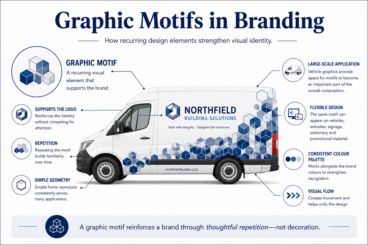
A graphic motif is a visual element or design idea that is intentionally repeated throughout a brand to help create a stronger, more unified visual identity.
Unlike a logo, which identifies a business, a motif works quietly in the background. It reinforces the brand through repetition, often helping separate brand assets feel like they belong together.
That doesn’t mean every business should have one. Like every branding decision, the value of a motif depends on the business, its audience, its applications and the image it wants to project.
A motif isn’t designed to attract attention. It’s designed to create familiarity.
What makes a good motif?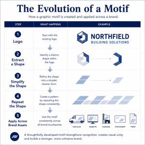
The strongest motifs are often the simplest. Like any other branding asset, a motif should have a clear purpose.
For businesses with multiple touchpoints—vehicles, signage, printed material, websites and social media—a motif can become a subtle but powerful part of the overall brand.
Rather than trying to communicate a message on its own, a motif quietly supports the brand. It should be easy to repeat, work well at different sizes and complement the logo rather than compete with it.
Whether abstract, geometric or inspired by elements of the logo itself, an effective motif should feel like a natural extension of the brand.
Why motifs work particularly well on vehicles
A vehicle offers one of the largest branding canvases most businesses own.
That additional space allows a motif to become part of the overall composition rather than simply filling empty space. Used thoughtfully, a motif can guide the eye, create visual movement and help unify graphics across large vehicle panels.
Unlike promotional messages, which may change over time, a well-designed motif can remain a consistent part of the brand for many years.
Good branding is intentional
One principle applies to almost every successful branding project:
Every visual element should have a purpose.
Whether it’s a logo, a mascot, typography, colour, a graphic motif, photography or a tagline, each element should contribute to the overall identity of the business. If it doesn’t, it probably doesn’t belong.
At Prima Graphics, we don’t see motifs as decoration. We see them as one of many creative tools available to strengthen a company’s visual identity.
For some businesses, a motif becomes a recognizable signature that quietly reinforces the brand wherever it appears. For others, a clean logo and thoughtful graphic design communicate the brand more effectively.
The best branding isn’t about adding more design elements. It’s about choosing the ones that work together to communicate your business clearly and consistently.